A Kommander Crash Course
License
This article is double-licensed under the Creative Commons Attribution-ShareAlike License and the GNU Free Documentation License. Code samples are in the public domain. Contact the author if you are interested in other forms of licensing.
Copyright © 2004 Michał Kosmulski.
|
This document is licensed under the Creative Commons Attribution-ShareAlike License |
| Permission is granted to copy, distribute and/or modify this document under the terms of the GNU Free Documentation License, Version 1.2 or any later version published by the Free Software Foundation; with no Invariant Sections, no Front-Cover Texts, and no Back-Cover Texts. A copy of the license is included in the section entitled "GNU Free Documentation License". |
| Code samples in this article are hereby put in the public domain. |
Disclaimer
The author disclaims all warranties with regard to this document, including all implied warranties of merchantability and fitness for a certain purpose; in no event shall the author be liable for any special, indirect or consequential damages or any damages whatsoever resulting from loss of use, data or profits, whether in an action of contract, negligence or other tortious action, arising out of or in connection with the use of this document.
A Kommander Crash Course
One of the strengths of Unix-like systems such as Linux is the ability to easily customize them and automate tasks using scripts. However, shell scripts usually need to run in a terminal window and thus don't integrate well with the modern desktop environments most people use. Kommander tries to remove this burden by allowing users to easily create graphical applications using any scripting language of their choice.
Kommander consists of two main parts: the Executor and the Editor. The Editor provides a development environment that makes creating graphical user interfaces easy. Visual programming is the paradigm and Kommander makes it possible to create applications using the mouse more than the keyboard. You can drag widgets such as push buttons, labels, and checkboxes from tool palettes and place them in the edited dialog box. You can establish connections between objects with the mouse using a mechanism known as signals and slots, so in many cases there is very little need to write actual code. Kommander provides only a few simple language constructs by itself and resorts to using other scripting languages to perform much of the real work. This means among other things that you can equip existing shell scripts with graphical user interfaces easily using Kommander.
Kommander is a relatively new tool and under intense development, so features are added and bugs get fixed often. If you want to try it, download the latest version, since it may be well ahead of the version shipped even with the latest KDE release. If you want to use the version that came with your KDE distribution, you will have to install the kdewebdev package, since that's where Kommander can be found. This article was written for Kommander 1.1development1 and newer. Thus, it will not work with the version that comes with KDE 3.3.2 (some parts might work if you skip others). If you have problems with running the newest Kommander development version (there were many reports of people being unable to get 1.1develoment2 to work), try an older one. Version 1.1development1 is guaranteed to work with this tutorial. All releases, old and new, can be downloaded from this page.
At this time documentation for the project is somewhat sparse, although that is to change soon. There are examples located in the kommander/examples/ subdirectory of the source tree, and kommander/working/ subdirectory contains notes on adding internationalization support to your Kommander apps. A number of useful utilities for Kommander as well as programs written using Kommander can be found on kde-apps.org. There is also a mailing list for Kommander users, where you can ask questions and report bugs.
The basics
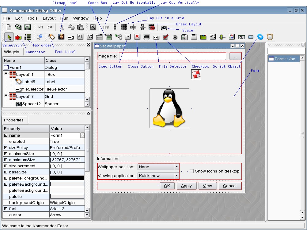
| |
| Click to enlarge |
In this tutorial, we'll create a simple application for changing your KDE wallpaper. We'll build the application step by step, to introduce basic concepts of Kommander first and gradually move to more advanced ones. We will also show how Kommander uses DCOP to communicate and integrate with other KDE applications.
Let's begin creating our application now. Start Kommander Editor, located in the Development section of your K menu (or run kmdr-editor from the command line if you can't find the program in your K menu). From the File menu, choose New..., select the Dialog icon, and click OK. A new empty window (referred to as a form in Kommander) will be created in the workspace. Note that in some older versions of Kommander, if you choose anything other than Dialog, you will be unable to edit some of the window's properties.
In the toolbar, there are icons with widgets you can add to your dialog. Click on the Exec Button icon, then click anywhere in the form to add a button. After you select the button by clicking on it, you can resize it and move it around in the window. You can also resize the dialog box.
In your workspace there is a window called the Property editor that allows you to change properties of your widgets. Click on any empty place in the form to select the main window of your app, and in the property editor find the property named "caption". Edit it so it reads "Set wallpaper"; this text will appear as the dialog box's caption. In a similar manner, you can select the button you added to the form and change its "text" property to "&View". The ampersand means that the next letter is to be underlined and used as a keyboard shortcut, so that pressing Alt+V in the dialog box will produce the same result as clicking the button. You can also simply double-click the button to edit its title. Now add another widget, namely a Close Button, and set that button's text to "&Cancel".
One very important property that each widget has is the "name" property, which is the name used to reference a widget in the program. Give all widgets descriptive names, so they can be easily distinguished, except perhaps for labels whose text is never changed, since there's no need to reference such static objects in program code. Set the two buttons' names to viewButton and cancelButton, respectively.
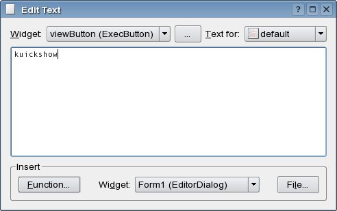
Now it's time to make the buttons perform some actions when clicked. Both the Exec Button and Close Button objects execute a script when clicked; a Close Button also closes the dialog box afterwards. Thus, we don't need to do anything more to make the Cancel button behave as expected. To edit code for the View button, right-click it and select "Edit Kommander Text" from the context menu.
| |
| Click to enlarge |
You now should see a dialog box for editing code. Use the combo box in the upper left corner for selecting the widget whose code you want to edit. In the upper right corner is a combo box labeled "Text for:", which lists so-called slots for the selected widget. We'll explain how slots and signals work later on; for now it should suffice that code associated with the default slot is the script executed when the button is clicked. The bottom part of the dialog box displays controls for inserting function calls. We'll make use of them later in the course of this tutorial.
You use the central part of the dialog box to edit code. As we mentioned before, Kommander can use any scripting language for adding actions to its widgets, but the default scripting language is sh or bash on Linux systems. Thus, the code you enter in the code window can be anything you would normally put in a shell script.
First, let's just try to execute a program. In the code editor for viewButton's default slot, enter
kuickshow
Close the code editor and run the Kommander script by selecting "Run dialog" from the Run menu or by using the Ctrl-R keyboard shortcut. You will be asked to save the script if you haven't done so yet. Your dialog should now appear and you can check that clicking the Cancel button actually closes the dialog box, while clicking View executes kuickshow. The View button will be disabled until kuickshow exits; this behavior can be changed by modifying the button's blockGUI property.
You can download the complete script to this point here.
Getting data from widgets
Now it's time to add a few new widgets and to create some interactions between them. Have a look at the screenshot of the completed application to roughly position your controls, but do not spend too much time tweaking their positions; once all widgets are there, we will use layouts to automatically position widgets in the optimal way.
Now add a File Selector widget and a text label to describe it. The file selector consists of a text field and a button that displays an "Open File" dialog box when clicked. We will use it for choosing the desktop's background image. Give the File Selector the name fileSelector. Change its selectionCaption property to something like "Choose background image" (this text will be displayed in the file dialog's title bar) and selectionFilter to "*.jpg *.png|Images (*.jpg *.png)" (this is the pattern for file names which are to be shown by default in the file dialog, separated from its textual description with a pipe character). As for the label, set its text to "Image file:" and resize it as necessary to display the whole text.
We have several widgets now, so now let's make them exchange some data. The first thing we'll do is to make the View button open the selected file using kuickshow. Open the Kommander Text editor for the viewButton and change the script to:
kuickshow "@fileSelector.text"
You can now run the dialog and check that once you open a file using the file selector, clicking on the View button opens that very file in kuickshow. What exactly happens here? The at-sign (@) is used to mark Kommander's special functions. When a script is executed, Kommander first parses it and executes all functions starting with @. Many functions return a value, which is then substituted for the original @function text. The resulting processed text is then executed as a regular shell script.
The fact that executing the script actually happens in two steps is not important now, but at some point you'll see that it becomes significant, with conditional statements and in some other more complicated situations.
In our particular example, we call the function @fileSelector.text, whose return value is the text entered in the fileSelector widget. Suppose you select the file background.jpg. When you click the View button, Kommander replaces this function call with its return value and the resulting shell script:
kuickshow "background.jpg"
is executed. The quotes are there so that sh can avoid confusion if the filename contains spaces.
| |
| Click to enlarge |
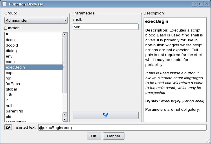
Kommander offers many functions to choose from for each widget, but you don't have to remember them all. The lower part of Kommander Text editor's window offers a lot of help here. When you click the Function... button, you open a new dialog box where you can browse the available functions. These are divided into several groups, which you can select using the Group combo box.
DCOP is the group that contains functions used for communication between your program's different widgets. After choosing a widget using the Widget combo box, you will see all the functions that you can call for that widget. Select a function and a brief description will appear to the right. If there are any required parameters, you can enter them into appropriate fields and press the button with an arrow pointing down in order for the corresponding function call to be inserted into the edit box at the bottom. On closing the dialog box with OK, Kommander will insert this code into your program. Other groups are: Array, used for array functions (we'll see an example of using them later); File, for file operations (these are more often performed with shell commands, though); String, for dealing with character strings; and Kommander, for generic Kommander language constructs such as loops and functions that don't fit into any other category.
Later in this tutorial we'll have complete code fragments for you to copy into the example program. In practice, when developing your own applications, you would probably want to use the function browser instead to find the necessary functions easily.
The complete script at this stage can be downloaded here.
Signals and slots
Now we will employ the mechanism known as "Signals and Slots" to add even more interaction between elements of the GUI. First, add the elements that are going to be involved. These are: a text label called "information" with the text "Information: " and a pixmap label called "preview". We are going to make these two elements display a short textual information block about the current image and a graphical preview of it. Again, position these elements only roughly in the window. Set the pixmap label's scaledContents property to "true" in order for it to scale the image it will display to the widget's size. In order to be able to see where the widget is, even if there is no image displayed inside, you can change frameShape to groupBoxPanel (or any other value you find visually appealing).
Signals and slots are an effective mechanism for widgets to talk to each other. A widget emits a signal when it wants other elements of the GUI to know that some event took place. By default, most signals are ignored, but we can tell widgets to listen for a particular signal and perform an action when it is emitted. This action is called a slot and the process described above is known as connecting a signal to a slot.
Some signals don't carry any information about the event that caused them to be emitted other than that an event of this particular type took place. Others contain additional data, which can be passed to the slot as parameters (a slot is really a special kind of function). Since the signal's parameters don't have names, a signal with some set of parameters can only be connected to a slot which either takes exactly the same number of parameters of the same types in the same order, or to one which has less parameters, but whose parameters are of the same type in the same order as the beginning parameters of the signal.
For example, a button emits the clicked() signal when it is clicked. As you see, the parameter list in parentheses is empty, so this signal can only be connected to a slot without any parameters. We could, for example, connect it to the pixmap's clear() slot. This would cause our button to clear the contents of the pixmap when clicked.
In contrast, a checkbox emits the toggled(bool) signal when its check state changes. This signal has one parameter of type bool, which can take one of two values: true or false. Since it has one parameter, we can connect it to a slot with 0 parameters and also to a slot with one parameter of the same type. A useful example would be connecting it to some widget's setEnabled(bool) slot. This way that widget would only be enabled if the checkbox were on and disabled if it were off. To get the opposite behavior, we could use the setDisabled(bool) slot.
As we'll see, Kommander eases the task of making signal-slot connections so you don't have to know what signals and slots each particular widget offers. Widgets usually have many slots associated with them and Kommander offers you a list of what's available and compatible with the signal you choose. Some of these are built-in and always execute predefined actions, while others can be user-defined and execute user code that is entered using the Kommander Text editor. Note that you can have many signals connected to the same slot and also one signal connected to many slots. This allows many actions to be taken when a single event triggers them (however, note that the order in which these multiple actions are executed is random). The beauty of signals and slots is that usually we can achieve quite a lot by using only the predefined slots -- thus adding functionality to our dialog box without writing a single line of code.
| |
| Click to enlarge |
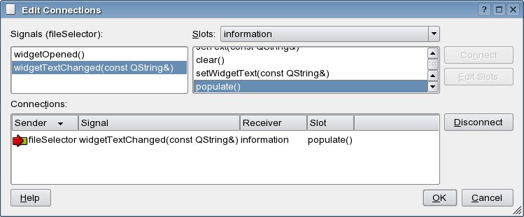
To create connections between signals and slots, we use the Connector tool. First we will make the preview pixmap label display a preview of the image whose name is entered in the file selector. After clicking on the Connector icon, press the mouse button with the cursor over the file selector widget and drag the mouse over to the pixmap label. You should see frames around the two widgets and a line connecting them. Let the mouse button go and a dialog box appears. On the left is a list of signals the file selector widget emits, and on the right, a list of slots of the pixmap label that can be connected to the signal selected in the left pane. Notice how the list on the right changes to show only slots with compatible parameter lists when you select different signals on the left.
To achieve the desired result, select the widgetTextChanged(const QString &) signal and then click on the setWidgetText(const QString &) slot. A new connection will appear in the connection list at the bottom. Click OK to close the window. If you ever need to remove a connection or otherwise modify it, you can find an option to open the editor in each widget's context menu.
Now, connect the file selector's widgetTextChanged(const QString &) signal to one more slot, namely the information text label's populate() slot. This is a slot that all widgets have and whose meaning you can define. As the name implies, it is usually used to populate a widget -- that is, to fill it with data.
Now, to change the widget's action taken when the population slot is executed, fire up the Kommander Text editor for our information text label and from the combo box labeled "Text for:" choose population. The code you enter here is a little different from what you entered for the View button's default slot, since it is treated as the text to be displayed in the widget rather than a shell script. So, in order to make the label display the text "Hello, world!" when the population slot is called, you would just enter
Hello, world!
in the code edit box. If you were populating a list box or a combo box, you would just enter all the different items, one per line. However, we want something more than just a constant string of text. You can use the command line program file to display some basic information about the data stored in a disk file. Enter this code for the population slot:
Information: @exec(file -b "@fileSelector.text")
As you probably guessed, this sets the label's text to the word Information followed by the result of calling file on the file currently entered in the fileSelector when populate() is called. You can now close the code editor and test the program. It should display a preview of the image and some information about it. That's quite impressive, given that we have written exactly two lines of code so far.
The complete script at this stage can be downloaded here.
Arrays
Now we'll make use of Kommander's array features to extend the GUI a little. Let's add a combo box to allow users to view the selected image not only with kuickshow but also with several other applications.
Add a combo box called viewingApplication and a text label to accompany it. Since this combo box is going to contain a static list of programs, we can simply edit it by right-clicking on it and selecting Edit... from the context menu, or by double-clicking on it. Add three program names: Kuickshow, KView, and The GIMP.
Kommander's arrays are so-called associative arrays -- they map text strings onto other strings. In our example, we will use an array to map item indexes in the combo box into program names as they need to be entered at the console (for example in order to run "The GIMP" we have to type "gimp" at the console). We use numbers as keys because it's convenient here, but keys could be arbitrary strings as well and need not be numeric.
Kommander's array function names start with @Array. First, we will add our mappings to an array called "programs". We want this array to be filled in just after our application starts, when the form's initialization slot is executed. To edit it, right-click any empty place on the form, select "Edit Kommander Text", and select the initialization slot. Enter the following code:
@Array.setValue(programs,0,kuickshow)
@Array.setValue(programs,1,kview)
@Array.setValue(programs,2,gimp)
Now our "programs" array maps "0" onto "kuickshow", and so on. The last change we must make in order for the application choice to work is to edit the View button's default slot again and replace the previous script with this one:
@Array.value(programs,@viewingApplication.currentItem) "@fileSelector.text"
As you see, we replaced the constant "kuickshow" text with a call to Kommander's @viewingApplication.currentItem function, which returns the viewingApplication combo box's selected item number (counting from 0). @Array.value reads the mapping of that number (which is really treated as a string) from our programs array. Our application now uses the program selected in a combo box for viewing images.
The complete script at this stage can be downloaded here.
Using DCOP
Our example application is growing in functionality fast, so now we'll add almost all the remaining widgets to the window. First, add a CloseButton called okButton and labeled "&OK", setting its "default" property to true. This will cause the button to become the default one, which is activated when Enter is pressed in the dialog box. Next, add an ExecButton called applyButton and set its text to "&Apply". Then, add a checkbox called "showIcons" with the text "Show icons on desktop", followed by a combo box called "position" and a text label with the text "Wallpaper position:" to accompany it. Double-click the position combo box to edit its contents and enter the following items: None, Centered, Tiled, Centered tiled, Centered maxpect, Tiled maxpect, Scaled, Centered auto fit. Preserve the order, as we will treat this combo box in a way similar to the viewingApplication combo box -- each item's position corresponds to a magic number that KDE uses to identify a particular wallpaper position.
We are now going to implement the functionality of changing desktop wallpapers. The key to this is the Desktop Communications Protocol (DCOP), which KDE applications use to communicate with each other. By issuing DCOP calls you can for example control your music player, enter text into an open KWrite window, or tell the KDE screensaver to lock your session. You can also get and set information related to the desktop background. General information about using DCOP and related tools can be found elsewhere, but there are two useful things to know. Firstly, you can check what DCOP calls are available for running applications using the program kdcop, which displays each application's interfaces in a nice tree. This program is a part of KDE itself and is not directly related to Kommander, though it is quite useful for people writing Kommander applications. As an exercise, after we enter our code into Kommander, you can try to navigate through kdcop in order to find the calls we used. Secondly, there is a command line tool, dcop, which makes it possible to issue DCOP calls from the command line. In some situations, you must use this instead of Kommander's built-in DCOP functions.
So, first we will use DCOP calls to set the initial values of our dialog's controls so they reflect the desktop's settings. One widget whose state is not set based on settings received from KDE is the wallpaper position. Unfortunately, there seems to be no easy way to get it using DCOP calls, so the best we can do is to set it to some arbitrary value, e.g. 6 (Scaled). Append this code to the form's initialization slot:
@fileSelector.setText(@dcop(kdesktop,KBackgroundIface,"currentWallpaper(int)",0))
@switch(@dcop(kdesktop,KDesktopIface,"isIconsEnabled()"))
@case(1)
@showIcons.setChecked(true)
@case(0)
@showIcons.setChecked(false)
@end
@position.setCurrentItem(6)
Clearly, the @dcop function is used to make DCOP calls. In the first call, we ask the application kdesktop to execute its currentWallpaper function available through its KBackgroundIface interface. This function takes one integer parameter (the virtual desktop number), which we pass as the last parameter to @dcop. The result of this DCOP call is used to set the file selector's text. In a similar way, we ask kdesktop whether desktop icons are currently enabled. By the way, your application can also issue DCOP calls to itself. Just use the special @dcopid identifier as the first parameter to @dcop.
As you see, we have to work around a small inconsistency, namely that setChecked function expects either true or false while the DCOP call returns 1 or 0. In Kommander versions newer than 1.1development2, we can use both the 1/0 and the true/false notation, so the much more obvious call @showIcons.setChecked(@dcop(kdesktop,KDesktopIface,"isIconsEnabled()")) can be used instead. On the other hand, thanks to this inconsistency in older versions, we get a chance to see an example of Kommander's switch/case instruction. Another possible workaround, which requires less code, is to use an array to map 1 to true and 0 to false.
Kommander offers an interesting way of getting the state of checkboxes and radio buttons. We will now use the value provided by the showIcons checkbox in a DCOP call. The @dcop function expects parameters of type bool to be either "true" or "false". When you open the Kommander Text editor for our showIcons checkbox, you will see that it has three special slots: checked, unchecked, and semichecked. The last one is for three-state checkboxes, which we will not discuss at the moment. The other two are quite interesting, however. When you enter a @showIcons function call somewhere, the text entered for one of these slots is returned, depending on the checkbox's state. So, just enter "true" for the checked slot and "false" for the unchecked slot, since that's convenient in our situation. In other situations, other values may be more appropriate. Imagine, for instance, that you have a button that executes ls in order to list a directory's contents (you would have to run the program from the command line to see the result). You can create a checkbox called longFormat and assign the text "-l" to its checked slot and the text "@null" to its unchecked slot. The latter one is a Kommander special function which simply returns an empty string. Now if your button's default slot has the script "ls @longFormat", "ls -l" will be executed if the checkbox is on and "ls" if it is off.
Now let's consider the OK and Apply buttons. They are both supposed to perform the same action, and the only difference is that OK closes our program afterwards (which is done automatically anyway, since it's a CloseButton). It would be nice to not have to enter the same code twice in two different places (and have to correct it in both places, too, when an error is found). Script objects serve this very purpose for us. They are objects that don't appear in running window and only serve as containers for scripts. We will now use one to make both Apply and OK perform the same action when clicked.
Create a new script object called applySettings anywhere in the form (it's invisible in the running dialog anyway). In the default slots of okButton and applyButton, enter simply:
@applySettings
This will cause the script contained in applySettings to be executed when these buttons are clicked. We could also use the longer form @applySettings.execute for the same effect.
The default slot for applySettings is rather simple and quite similar to what we already know. DCOP calls are used to set the wallpaper image and its position as well as to enable or disable desktop icons:
@dcop(kdesktop,KDesktopIface,"setIconsEnabled(bool)",@showIcons)
@dcop(kdesktop,KBackgroundIface,"setWallpaper(QString,int)", @fileSelector.text,@position.currentItem)
Notice how it now pays off that we conveniently made showIcons return directly "true" or "false" instead of some other values which we would have to convert to the desired format now.
Since we want the dialog box to be usable even without a mouse, we should set the correct tab order for the widgets. First, we will need to make the file selector selectable through tabbing since by default it isn't. In order to do that, change its focusPolicy property to StrongFocus, which allows the widget to be given input focus both using the mouse and using the Tab key. Next, select the tab order tool and click on widgets until the displayed numbers reflect a sensible order. Users will now be able to navigate the dialog easily using the Tab key. After you're done, choose the Selection tool again to return to previous mode.
Our application has now got all the functionality we want it to have. The only thing that's not quite as good as it should be is the widgets' positions and sizes, which are rather random at the moment. Using layouts, we'll get this fixed in no time.
The complete script at this stage can be downloaded here.
Layouts
Layouts provide a way of automatically placing and resizing a window's widgets in a reasonable way. Generally, a layout is like a box in which a number of widgets reside. Layouts can contain not only widgets but also other layouts, which makes arranging large sets of widgets possible. There are three types of layouts in Kommander: horizontal (where items are placed side by side), vertical (items placed one over another in a column), and grid, where widgets are placed in the cells of an imaginary table.
We will now add some layouts to our dialog box. You can have a look at another tutorial for a better description of all the different layout types (it is based on Qt Designer, which was used as a basis for Kommander Editor, and as such it is very similar).
The way widgets will behave once packed into layouts depends on some of their properties. The sizePolicy property has two important subproperties: hSizeType and vSizeType, which control how the widget's horizontal and vertical sizes change inside the layout. Some of the most often used values are: Fixed (the size cannot change), Preferred (the widget stays at its optimal size if it can, but it can also shrink or stretch to fill empty space if necessary) and Expanding (the widget can shrink but it prefers to stretch and is very willing to do so). Other values are explained here. Widgets also have minimumSize and maximumSize properties, using which you can restrict them from growing too large or shrinking too small. An extra tool used with layouts is spacers, which are widgets that aren't visible in the running application, but which are used to push other widgets into appropriate positions (in the editor, they are represented by objects resembling springs). There are two types of spacers: horizontal and vertical. Spacers have a sizeType property using which you can control how they affect other widgets. "Expanding" is the most often used type, and we will not discuss other modes in this article.
The best way to learn about layouts is through hands-on experience, so let's lay out our sample dialog. First, we will line up the four push buttons. We want them to always stay aligned with the dialog box's right edge, so add a horizontal spacer just left of all the buttons. Now, select the spacer and the four buttons and from the context menu select "Lay Out Horizontally" (or click the horizontal layout icon in the toolbar). The objects are now surrounded by a red frame indicating that a layout is controlling their sizes and positions. You will notice that you can't resize or move widgets that are inside a layout, even though you can change their other properties. To be able to manually change the widgets' sizes and positions, you have to right-click the layout and select "Break Layout" from the context menu. You can move the whole layout around and resize it. You will notice that when the layout is resized, widgets inside are moved and resized too, according to their sizeType properties. You will also notice that the spacer actually works, pushing buttons to the right side of the layout regardless of how we scale and move it.
In the next step, create a grid layout using the wallpaper position and viewing application combo boxes and their labels, using the technique outlined above. By default, combo boxes' horizontal size type is set to Minimum, which means that the widget can't shrink below a certain size (this will be the size it was at the moment it was added to a layout). When you horizontally stretch the newly created layout, you will notice how the labels and the combo boxes expand equally. This is because both Preferred and Minimum allow the widget to grow and are, so to say, equally strong. In contrast, Expanding indicates that a widget is more willing to grow than one using Preferred size type and that it will try to take up as much space as possible. When you now change both combo boxes' horizontal size type to Expanding, you will notice that now resizing the layout causes labels to stay the same size all the time, while combo boxes take up all the remaining horizontal space.
To exercise using spacers a bit more, we will align the checkbox to the right window margin, too. Put a horizontal spacer between the layout created in the previous step and the checkbox. Select that layout, the spacer, and the checkbox, and from the context menu choose "Align Horizontally". This again proves that we can put one layout inside another. You can resize the outer layout to check how the different widgets inside it behave now. In order to make the file selector and its label play nicely together, put them both in a horizontal layout, too.
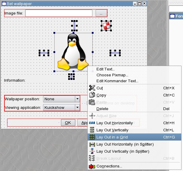
| |
| Click to enlarge |
Now comes the tricky part -- positioning the image preview and the script object. In theory, a script object is completely invisible in the window. However, in some older Kommander versions, while it is transparent, it can influence layouts and appear as empty space in the window. Thus, to make sure the window will look good in all versions, we will create a layout which prevents the script object from messing up the rest of the widgets.
First, we will change the image preview's minimumSize and maximumSize properties to 40x30 and 400x300, respectively. This is to prevent the window from becoming excessively large when a large wallpaper is opened. Now, surround the image preview with four spacers laid out in a cross pattern: one vertical spacer above and one below the image, and one horizontal spacer to the left and one to the right of it. Now, make sure that the script object is located to the right of and above the image. Select the image, the four spacers, and the script object and lay them out in a grid. Since we placed the script object in the upper right corner of our 3x3 grid whose center is occupied by the image preview, it can't distort the layout of other widgets very much (in worst case it adds a little margin around the image). To reduce its destructive effect, set both its size types to Ignored, which will basically let it expand and shrink to any size.
Our dialog is almost finished now. The complete script at this stage can be downloaded here.
The last step to perform is to create a layout which will take care of positioning the layouts we have already created. First, resize the layout containing the image preview to be large enough to contain the 400x300 maximum size we assigned to the preview (when you resize an object you can see its current size in a tooltip). Resize the form as needed, too. Once all objects in the window are roughly positioned, right-click on an empty place in the form and select "Lay Out Vertically". This way you create a layout that encompasses all the top-level objects the window contains. You can now resize the window and see all the widgets nicely move and resize to fill the window's contents. In a similar way, you could lay out objects located inside a group box by choosing the appropriate layout option from that group box's context menu.
The application is now complete. You can use all the widgets' functionality and resize the window to put the layouts at work.
The complete script for the finished application can be downloaded here.
Notes on executing Kommander scripts
Kommander programs are not compiled into binary form, but a special program, Kommander Executor, reads the source files and executes them in a way similar to how shell scripts are run. This makes distributing software simple, since most projects need only this single source file to be distributed. This eliminates problems with binary incompatibility or package management systems. If you plan to create and distribute Kommander apps, you may also want to have a look at Kommander Project Tools, which simplify this task.
Kommander scripts usually have the extension .kmdr and are internally XML files, which means they can be viewed and edited with a text editor, should a programmer find some reason not to use Kommander Editor. To execute a Kommander program, simply click on your .kmdr file in Konqueror. To run it from the command line, invoke Kommander Executor with the following command:
kmdr-executor your-script.kmdr
For often-used Kommander programs, it is convenient to put the above statement inside a shell script.
Conclusion
In the course of this tutorial, we have created a working Kommander application without writing much code. Kommander makes rapid development of small GUI applications easy and often frees the user from having to use more heavyweight languages like C++. Superb integration with existing command-line tools and shell scripts puts the power to create graphical applications for KDE in the hands of people with little or no programming experience. Finally, thanks to DCOP bindings, integration with KDE is a breeze. We are certainly going to hear more about Kommander soon.
History
- 2005-01-25 — version 1.1; article is published with minor corrections on author's homepage (double-licensed under the Creative Commons Attribution-ShareAlike License and the GNU Free Documentation License)
- 2004-12-21, 2004-12-24 — version 1.0; article is first published in two parts: Part 1 and Part 2 on linux.com
See also:
- This article as published on linux.com:
- Computing main page
- Kommander homepage
- Download site for all Kommander releases, including obsolete ones
- Search for Kommander applications on kde-apps.org
- Kommander Project Tools
- Introduction to DCOP and related tools
- Qt Tutorial: Layouts
- Qt Tutorial: Layouts (ctd.)
- Description of the sizeType property
- Kommander Looks to Shake Up the Desktop